Grammar tips for scientific writing

I have a side job for a few hours a week editing scientific papers. I thought I'd share a few of the problems that I come across most often.

What's the point in this?

Language is an ever-evolving thing and grammar and spelling can, and do, change over time. However, it's important to have a grasp of the language rules that are in common usage. When people are communicating with each other they need to have a common language so that ideas can be conveyed unambiguously. Mistakes in grammar and spelling can lead to a lack of clarity. Additionally, small mistakes can cause readers to stumble while they're reading your text, which distracts them from your main point.

Style guides

The first port of call when formatting your paper for publication is the style guide of the journal you're sending it to. They'll often have specific things to say about referencing, units, and structure.

Fewer/less

Fewer is used for countable, discrete quantities, and less is used for continuous quantities. Example: fewer apples, less sand.

Affect/effect

For the most common usage (i.e. a change in something), affect is a verb, and effect is a noun. An example from Grammar Girl:

The arrow affected the aardvark. The effect was eye-popping.

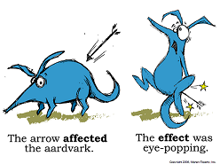
Rarely, you might see affect being used as a noun and effect as a verb, but these words have different meanings - an affect is an emotional state, and to effect is to bring into being. Example: the secretary had a positive affect when he effected a new filing system.

In general, just remember the aardvark.
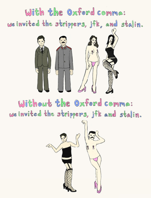
The Oxford comma

The serial, or Oxford comma comes before the last item in a list. For example: lions, and tigers, and bears! (Oh my!)

It's seen as somewhat old-fashioned, but can often add clarity. It's acceptable to miss it out in most lists, and only add it where it's necessary to disambiguate something.

With the Oxford comma: we invited the strippers, JFK, and Stalin. Without the Oxford comma: we invited the strippers, JFK and Stalin.

Species names

When talking about a species by its Latin name, the genus name is capitalised, the species name is given in lowercase, and the name is italicised. If you're shortening the genus to its first initial, the initial has a full stop and a space after it, not a hyphen. So you would say E. coli or Escherichia coli, not e-coli, E.coli or E. Coli. The first time you talk about the organism, you should use the full name.

et al.

You may want to shorten references with multiple authors by using et al. There is a full stop after al and not after et. Sometimes et al. is italicised, but not always - this will depend on the style guide of the journal you are submitting to.

Synonyms for 'use'

I realise it can get boring to use the same words over and over again, but sometimes repetition is the best thing for clarity. The word use  crops up a great deal in methods sections, and so do other words in its place. Employ is a word I see very often in this context. Unless you're giving your reagents a job, don't use employ to mean use. The word utilise gets a bad rap, but it's useful in some contexts: it doesn't mean use, it means make use of. Example: Vitamin C helps the body to utilise iron.

Tenses

Expectations on whether to use the past or present tense vary wildly between disciplines. In biology, you often use the past tense for methods and results, and the present tense for conclusions and stating general facts. Take your cue from other papers in your subject area.

Passive vs. active voice

Active voice: I ate the cake. Passive voice: the cake was eaten.

I don't know about you, but I learned at school that in scientific writing, the passive voice must always be used. This is old-fashioned advice: the active voice is just as acceptable. The important thing is to pick an option and be consistent: for example, you could use the active voice for things that you do, and the passive voice for other peoples' studies.

Beginning sentences with 'and', 'but', or 'because'

No.

Further resources

I recommend Lynne Truss' book, Eats, Shoots & Leaves as a general primer on these things. You can also check out the Guardian Style Guide (they also have a Twitter feed!)

If you find yourself grasping for words when you're writing, the Academic Phrasebank can be a useful tool for finding sciencey words to use. However, remember that clarity is far more important than style: if the boring way to write it is the most unambiguous, it's the right way to write it.


...

Making a poster in Inkscape

I went to Physiology 2016 at the end of July, and I presented what I think was definitively my Best Poster Ever.


Poster selfie!

A photo posted by Beth McMillan (@teraspawn) on

I usually make my posters in LibreOffice Impress, but this time I had some trouble with Impress crashing and so finally decided to make the switch to Inkscape, a free vector graphics program which works on Linux, Mac and Windows. I'd used it previously for making some vector graphics, but I still learned a lot of new tricks in making this.

One word of warning - I used the Linux version of Inkscape, and I'm not sure if everything's in the same menus for all versions.

Change page size

First things first: set the page size to your poster size. Mine was A0, which is an option in the list, but you can also enter custom values. Go to File > Document Properties > Page, or Ctrl-Shift-D > Page.

Navigating

I seem to constantly hide the scrollbars by accident. The shortcut to show/hide the scrollbars is Ctrl-B (you can see why I might have this issue...)

There are also some useful shortcuts for different zoom levels - 5 zooms out to show you the whole page and 1 gives you a 1:1 zoom.

Snap to Grid

First, show the grid by going to View > Grid, or #.

Then, tailor the grid to the size you want by going to File > Document Properties > Grids, or Ctrl-Shift-D > Grids. It's a good idea to change Spacing X and Spacing Y to integer divisions of the page size - e.g. I wanted 100 squares across on an A0 page, which is 841 mm, so I set the grid to 8.41 mm squares.

You want your boxes to line up, so select the "snap to grid" button from the top of the toolbar on the far right of the screen. To snap to grid when you're resizing boxes, select the "snap bounding boxes" button, which is the second button on the far right toolbar.

Align & Distribute

This toolbox was very useful for centring the titles of my boxes. Bring it up with Option > Align & Distribute, or Ctrl-Shift-A. Select a box and an element inside it, and then use the buttons to align the element with respect to the box.

Cropping images

To crop an image, create a rectangle the right size and position it over the original picture. Select both objects and go to Object > Clip > Set.

Group and Ungroup

When it comes time to reorganise sections on your poster, it's useful to select a whole area and group all of the objects together, so you can move them as one. If you want to edit an individual component of the group, you can then ungroup the items. Go to Object > Group or Object > Ungroup, or Ctrl-G/Ctrl-Shift-G.

Text boxes

Wrapping text in Inkscape has to be done in a somewhat roundabout way. First, make a box that is the size you want your paragraph to be. Then, select the text and the box and go to Text > Flow into Frame (or Alt-W).

It's a bad idea to resize a text box after you've created it, because you'll end up changing the font size while you do it. I'm not sure how to fix that problem! You can re-flow the text into the box if you need to change its shape.

Fonts

I like to use fonts other than the usual Calibri, Arial, or Times New Roman, just for a bit of variety. We're not talking Comic Sans or anything particularly wacky, but there's enough difference between even fairly conservative fonts to look a little different. Google Fonts is a useful resource for nice, downloadable fonts.

For the A0 poster I made for my latest conference, I was recommended to use a 96 point font for the title, 48 point for the section headings, and at least 26 point for axis labels. I used 32 point font for the body text, and I think it looked right.

Matlab figures

If you use Matlab for your figures, you can export them directly as vector images. I made a Matlab script for printing out an eps and a png of the active figure, given X and Y dimensions in cm and a filename: tidyprint.m

Logos and colours

I would hugely, massively, incredibly strongly recommend that you use vector versions of any logos or pictures that you include in your poster. Pixellation is incredibly noticeable, especially at the large sizes that you're likely to be using. For example, the EPSRC and Oxford both offer vector versions of their logos.

If you want to take some of your colour scheme colours from a logo or picture that you're using, the eyedropper tool (F7) lets you pick up and use a colour from anything in your document.

To make the built-in Inkscape palette a little easier to access, click the triangle to the right of it and select "wrap" so you can see them all at once.

It's important to make your poster colourblind-friendly. I was recommended the ColorBrewer website, which can create you a palette to use. In general, steer clear of rainbow palettes, and replace green-red pictures with magenta-cyan pictures.

I'm really happy with how my poster turned out in the end and I'm sticking with Inkscape for all future posters. I hope that these tips were useful - if you have any more, share them in the comments!

...

Voltage clamping things in Chaste

It's quite useful to be able to clamp the membrane voltage of a cell you're simulating to a particular value. I have found myself wanting to clamp the voltage to a series of values, or even a whole voltage trace from another simulation. There isn't an easy way to do this in Chaste (yet - if I have time I'd like to make it into an easy function), so I'm sharing the bit of code I wrote to make it happen.

If you've not run single-cell cardiac models in Chaste before, look at this tutorial, and if you need to install Chaste on a Debian machine, try this.

First, include ALL THE THINGS:
Continue reading Voltage clamping things in Chaste

...